In which I rip into the latest “technical beta” of Windows Media Player. Summary, same suckage, slightly shinier look, two or three nifty things.
Saw a couple of days ago that Microsoft had released a new version of it’s less-than-fantastic “all in one” media player, version 10, and decided to check it out. In a fit of boredom and an attempt to stave off heatstroke in my hot little office, I figured I’d write a little review while ignoring my list of other things that are screaming to be done.

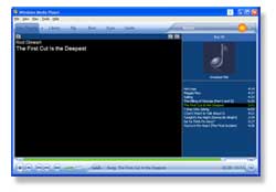
The first thing you’ll notice is the new look. It’s shiny and new, but pretty similar to the previous version. The look seems to be going a bit more towards the blue look of Office 2003. Nothing overly exceptional here, except that the top bar is now a bit nicer, giving you a pretty clear indication of how to get to new tasks. Of course, this doesn’t affect what you’re doing at the time. The thing that bugs me here is that the “movies” tab is off by itself. It acts pretty much the same as rip, burn, sync, etc, in that it causes the main area of the program to be loaded with information, but for some reason the designers chose to separate it from the rest of the tabs, and change the text color. The orange button to the right of that is not actually part of the program, but is the icon for CinemaNow, one of the movie companies that MS no doubt partnered with. Clicking on the big orange, or the right arrow button beside it, gives you a dropdown of the available services (currently CinemaNow, Napster, an about link and “browse all”) The screenshot in the ‘about’ link indicates that the rest of the right hand area is reserved for other non-microsoft services, but until there is more than one, it really does look pretty odd.

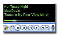
The minimize to toolbar mode got a minor adjustment in that it now includes the song position bar in the little pop up window that you get when you mouseover. I don’t know if I’d use this, but it’s nice to see as an addition.
As before, there are some elements of the interface that are not well marked and kind of a “lets click here and see what happens” sort of user interface. The small button in the far bottom right for example is “go into skin mode” and the fast forward looking button just above it (on the right of the song position slider) is fast forward, but with a horrible user interface. Click it once and suddenly your song is going at 2x the speed. Click it repeatedly and instead of going back to normal speed, it goes 3x, 4x, and then finally back to normal speed. The button gets more tiny little “>” symbols on it, and gets a pushed in look, but on a screen with reasonable resolution this isn’t really obvious.
The rest of the normal operations are pretty standard, and nothing has changed significantly from WMP9. The iTunes interface still beats it hands down.

One of the big new features is that WMP will now sync with portable media devices. All but the iPod I’m sure anyway. I remember that Scoble talked about why everyone knew what an iPod was when MS had a 500 or something like that players that were wmv compatible, and was bitching that they didn’t exploit this (hardly any of these devices are of course, anywhere near as cool and featured as the iPod, but the MS criteria was no doubt “non-apple”). Looks like someone was listening to him, as a welcome addition to the new WMP is the ability to

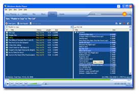
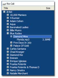
sync up with my mp3 player, the Rio Cali. It’s pretty straight forward, you plug your device in and it and it’s files show up on the right hand side. The tree view of your files also includes virtaul “roots” for selecting by artist, album, etc.
You can select files on the device and delete them, or queue up files to sync up to the device on the left hand pane. Some of the UI is the “click and see what the indistinguishable icon does” style, so be careful when you find the ‘format media’ button. The syncing is similar to the software that was included with my mp3 player, so it makes sense. Personally I’d have preferred to see a way to simply drag songs on and off the device as if it were another drive, but oh well, this is how they decided to do it. It also doesn’t appear that playlist managment is supported here, at least for my device.

I have to give kudos to the WMP team here for fixing one of my big complaints not so much about WMP itself, but the way that people play their music. A lot of times you’ll have a nice playlist set up, then accidently click on a music file, or select an operation from another program that loads up your media player and boom, playlist gone to be replaced by the single song you clicked on. Sucks to be you. Now (at least I think this is new), you have the option to resume playing your playlist by hitting the ‘previous’ button when you load up a single song. Very handy.
There are some big UI stupidities still. Their “we’re a window, no we’re a cool shaped window, no we’re a window” way of doing things might be cool, but it’s a big pain in the ass because when you have the player set to be a cool window (no standard title bar, close button, etc), you still can’t move it to the top of your screen, because Windows still acts as if the titlebar is there, and stops you from putting the player with the (non-existant) titlebar off the screen, meaning WMP10 can never reside right at the top of your screen. Personally looking at this as an issue is looking too closely, one should be looking at getting rid of the stupid looking skin/dual mode system and just make it a normal window. At least on the mac iTunes follows the rest of the iApps in it’s non-conformity. No other MS apps that I know do this.
Some functionality is still not hugely discoverable. For example, just now I found where you can set the CD burn functionality to burn a data CD instead of an audio CD (hint, it’s in a dropdown somewhere). I guess when you know where to find it, it’s easy, but if you don’t the obvious places (options, properties for the CD) leave you wondering if you can burn a data CD.
Not much else to say, thanks for reading, corrections and bitches to the email address of alan awy ufies dawt org.