My latest bitch is about how “modern” web design is conflicting with password managers. Normally, a login page has three essential elements. A text field for a username, a text field for a password, and a button for logging in. That’s it. If you’re using a modern and secure system then there’ll be the next page for you to enter your 2 Factor authentication info.
Simple right? Three elements, two text fields and a button.
With password managers (basically a necessity in this day and age), this works great. Go to the page, it autofills or prompts you to fill in the fields, you hit enter and boom, logged in.
But now more than a few login pages in apps and sites (this is from Synology’s latest DSM operating system) look like this:
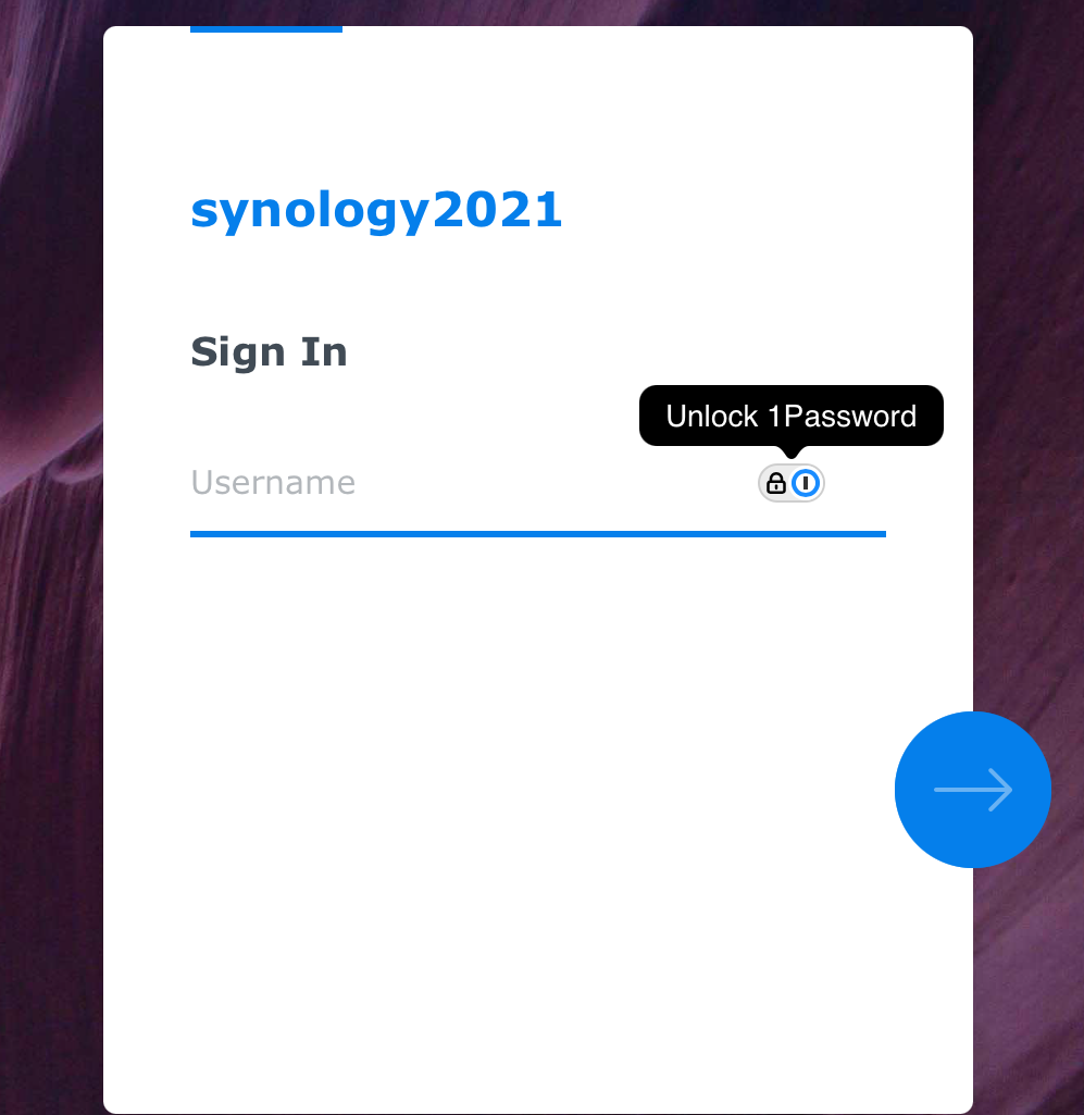
Only a username to put in.
This means that now you go to the page, your password manager prompts you to sign in, and it enters… your username. Then you hit the login (or in this case “->”) button, and then you get another page, with another field for your password, and another login button.
Literally twice as much time for zero benefit. I honestly can’t think of any reason that you’d need two interactions on a login page. There can’t be that much going on behind the scenes when you submit your username that it needs the page to reload. Even if there was some sort of massive supercomputer doing massive calculations based on your username (checking if it’s an SSO, pulling data in from Google/MS/Business Suite/Facebook/whatever) the time difference between a user hitting “->” the page loading and then putting in a password and hitting “->” again can’t be significantly more than just a spinner when you put in your username and password on the same page.
This has been your yearly installment of “stuff that grinds my gears” 2025.