There are many Pebble Smart Watch reviews, all similar, all unique.
This is mine.
I heard about the Pebble Watch on Kickstarter the day that it made it’s goal, and even though I didn’t write about it, I did back it immediately. I got back into wearing a watch a couple of years ago with a gift from my grandmother, but the watch strap has been slowly deteriorating, so it felt like a good excuse to replace it.
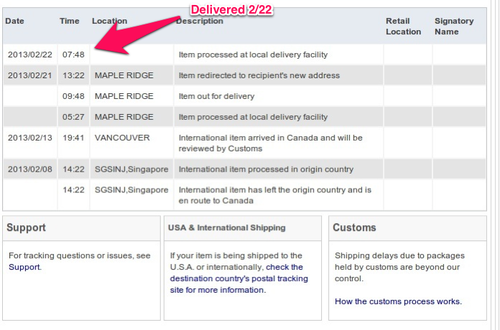
The Pebble team originally planned an October 2012 release, but as time moved on, it became more obvious that they weren’t going to make it. Instead of promising another release date, and potentially breaking it, they did the smart thing and said nothing until they knew a schedule that would work. They announced that shipping would start January 23. Long story short, mine finally arrived today, after an extended stay in Vancouver customs and one false start.
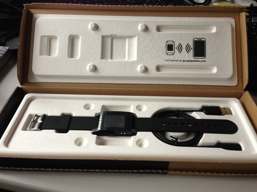
The “out of box” experience is good, the shipping box is unique, fits the watch well, and there was no shifting of the watch. There was no documentation inside, no quick start guide, but I suppose if you’re the sort of person who guys a Smartwatch off of the internet via Kickstarter, you can figure stuff out yourself. The watch is smaller than I thought it would be, but still not “tiny”. Definitely not a downside.
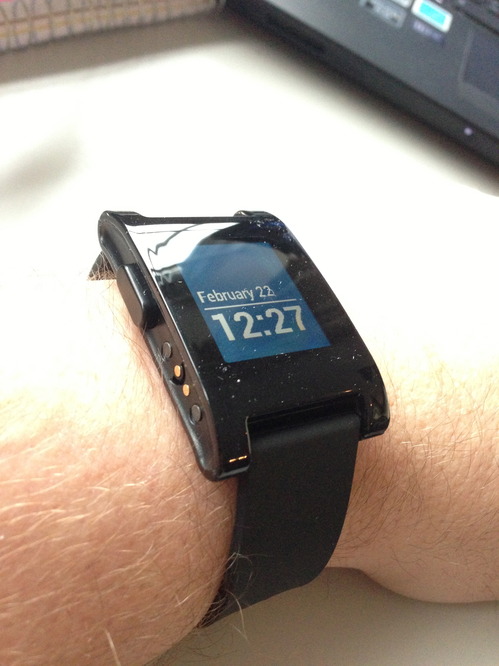
The screen is just the right size I think, or pretty close to it. The wrist strap is less “plastic-y” than I thought. Seeing the reviews didn’t prepare me for the soft plastic that it is made out of. Not low quality as far as I can tell (not being a plastics expert), and pleasant against the wrist.
Watch build quality is good, but not perfect. The seams aren’t perfect, and there is a bit of odd distortion on the e-ink display that others have noted. Not a big deal though.
The software is simple and easy to understand. There are some bugs (being able to re-order downloaded watch faces, some backlight oddness, etc), but they are all (potentially) easily fixable with software updates. Some software updates to the watch has already been made to fix things like notification display and backlight control. The ‘flick your wrist to turn on the back light’ is a nifty feature as well.
I’m not a BlueTooth borg person, so I’m not used to having my phone tethered to BlueTooth. I was a bit worried that the battery would die sooner than normal, but my iPhone 5’s battery has only seemed to wind down a bit faster than normal (maybe 5-10% faster?) but it’s hard to tell as usage is pretty much dependant on the user. It’ll take a few more days of use to see.
Right now the watch is a bit plain. On the iPhone it can:
- show the time, with different watch faces that can be used.
- control the music on your smartphone
- display some notifications for SMSs, calendar events, incoming phone calls, and emails (android is less restricted by Apple’s draconian rules about what you can and can’t get notifications for, and lets you have much finer grained control of what notifications (and you get more of them))
… and that’s about it. No, not buyers remorse, but you have to remember that this is, in essence, just a watch with a couple of extra bits, not a magic do-everything smart watch (yet). That said, the ability to see what my phone is trying to tell me without pulling it out of my pocket is pretty awesome. Is the text ignorable? What thing is it that I’m about to be late for? Etc.
So conclusions…
Is it cool? Yes. Is it worth the (now) $150 cost? Probably, but it’s definitely something for people with a bit of disposable income. Do I love it? Hell yea 🙂


